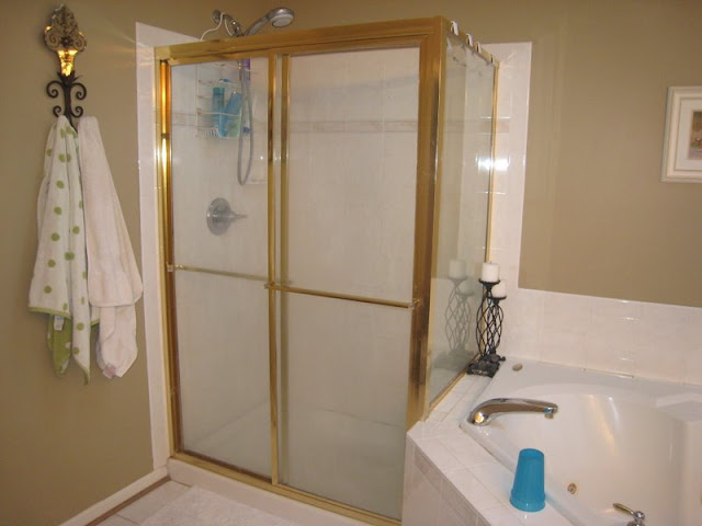
it was fine...but the shower was so gross...and it just wasn't "us".
you might remember that the whole renovation started with pat ripping the whole shower out one night without talking it through first. that didn't go over so well...but i sure do love the end product!
the before:


gotta love that light fixture!


ewww!
and i DO clean people!
that stuff is like UNDER the caulk.


we did everything except the shower doors ourselves.
pat spent HOURS taking out caulk and grout and re-doing it.
we primed...painted...installed a new light fixture and mirrors and toilet seat and tp holder and cabinet knobs.
we got new towels (we had the ones from when we got married...11 years ago!)
but the other accessories on the wall and counter and hamper are the same!


i made a new curtain.
no measuring.
bought fabric i liked.
used the same curtain rod that came with the house.
and sewed like a crazy non-measuring person one night.
it's dark brown and white...hard to tell in the picture.
i love it!

the little sign over the toilet doesn't match.
but it's one of my favorite possessions.
it says, "the best thing to spend on your child is time"
pat gave it to me when rebekah was our only child.
there was this art store i LOVED to go to and walk around.
every time we went on a date...that's where i wanted to go.
but it's the kind of store that you could never afford to buy anything in.
especially us.
we had a $25/month entertainment {which included going out to eat/renting movies/anything "fun!} budget at the time.
he bought me that as a surprise one day.
i can't even remember if it was a holiday or not.
but it meant SO much to me.
because i knew we didn't have the money.
and because he knew how much i loved being a mom!
it doesn't match anything in our home.
but it will always be a priceless gift.

a picture collage of our 10 year anniversary trip to charleston.

and look at the clean caulk! :-)

and, don't tell pat, but these $.44 light switch covers just might be my favorite part!
they make SUCH a difference!
the ones before were painted the same color as the wall.
why??
why in the world would you do that??
it looked so awful!
LOVE my white lightswitch covers! :-)

we love it.
i think it turned out great!
next project is our study...we started it today...trying to gain some control and simplify the piles of books all over our house!

16 comments:
Oh it looks so great! And clean and fresh.
Wonderful.
We have that issue in our shower too. Its my next project!
it looks INCREDIBLE!!! SO many millions times better than the bright shiny GOLD!! :) (i can say that because i bought a house that has more shiny gold than i would prefer!!!)
WOW it looks great, you guys did a great job.
just beautiful...on top of your many talents, you can add interior decorator...you are hired!!
it is gorgeous. i loved seeing what you did because we are in the process of redoing ours right now (not as extensive as yours) but i am getting ready to paint tile (we have some peach tile around our tub - yuck!! i can't stand the color peach!). i am nervous about painting it but we shall see. we choose a slightly darker blue for our walls than what you choose. thanks for sharing the pics! you guys are SUPER talented!!
Looks great!
You did an awesome job! I wish we could finish projects that fast, but we don't have 4 kids and a TON of other things going on...what's our problem?!? I LOVE IT!!
looks so great. good job with your choices ;) that was fast!
it looks so fresh and clean! love it :)
I LOVE it!!!!
it looks great!
we just started our bathrooms a wk ago---gonna be a long process so very encouraging to see a finished product!!
GREAT job! :)
you aren't going to want to leave...lol, it looks so great and you all did a great job. I love the sign and it looks great there, especially the meaning behind it :)
Love it! I'm on a blue kick right now....even though practically nothing in my house is blue...yet! And I'm with you on the gross chaulk....so glad you got that all fresh and clean!
it's beautiful Courtney! i love it! i bet you just LOVE walking in there too. :)
Blue and brown?!?! Are you kidding? i love it! Shower looks amazing. And those mirrors i LOOOOOOOOOOOOOOOOOOOOVE. it looks awesome! xo
Nice collection of Bathroom Cabinets for your modern bathroom.
Wow! You said you redid the master bath, but you REALLY redid it! It looks awesome. In a few years when I redo ours at our new home, I'll need you to come down and consult with me. I love the light blue color...that came out great. Do you mind telling me sometime about what it cost to replace the shower doors? That looks so much nicer than the gold (or in our case silver right now) chrome surround stuff.
Post a Comment